Have you ever wondered how some people seem to be able to recognize every vehicle they see on the street? We’ll let you in on their secret — they don’t go around memorizing the details of every individual model.
Instead, they just need to know what the most popular car logos look like and go from there. So if you want to look like a car connoisseur too, study the following list!
A Comprehensive List of Car Logos for Automotive Enthusiasts
1. Abarth
Image source: Pinterest
Abarth is an Italian manufacturer of racing and road cars founded in 1949. The brand’s parent company is Stellantis, a corporation that resulted from a merger between Fiat Chrysler Automobiles and the French PSA Group. That name will come up pretty frequently on this list, so it’s worth remembering.
Abarth has quite a distinct shield-shaped logo featuring a black scorpion on a yellow and red background. The company’s name is spelled out at the top, separated from the main design with an Italian flag-colored stripe.
2. Acura
Image source: Pinterest
Acura is a Japanese luxury car brand that exists under the Honda Motor Company umbrella. In fact, the brand’s success quickly inspired Toyota and Nissan to come up with their own luxury vehicle marques. As for Acura’s logo, it looks somewhat inspired by Honda’s original emblem.
Namely, it has a somewhat squared-off circle with a stylized version of the letter A in the middle. According to the company, the logo also symbolizes a calliper, a precise measuring instrument that represents the exceptional quality of Acura vehicles.
3. Alfa Romeo
Image source: Pinterest
Alfa Romeo is another world-famous Italian car manufacturer. Founded in 1910, the company has since become a part of Fiat Chrysler Automobiles, then Stellantis. It has one of the most recognizable car logos you’ll ever see, with a navy circle surrounding the two main motifs. Both images — the red cross and the green Visconti serpent — represent the municipality and culture of Milan.
4. Aston Martin
Image source: Pinterest
Aston Martin is a British manufacturer that produced some of the most iconic sports cars of the 20th century. Even if you don’t recognize the name of the company, you’ve probably seen its logo in several James Bond movies. While it has changed a bit over the years, most of its iterations have had a winged design with the company’s name written across the center.
5. Audi
Image source: Pinterest
Audi is a German automotive manufacturer founded in 1909. After Volkswagen bought it in the 1960s, it acquired several subsidiaries of its own, including Ducati and Lamborghini. So it’s only natural that the brand’s logo should represent its history of merging with other companies. Specifically, the four interlocked rings represent the four car manufacturers that created Auto Union, Audi’s predecessor.
6. BMW
Image source: Pinterest
The core of the symbol that represents this German manufacturer is split into four equal sections. They’re blue and white, which are the official colors of the State of Bavaria in Germany. Notably, though, the shape has also been interpreted as a propeller due to the design of the company’s advertisements from 1929.
Throughout the company’s history, its car logos have featured a black circle with the letters BMW written across the top. But in 2020, the company rebranded with a more sophisticated, white design.
7. Bentley
Image source: Pinterest
Bentley Motors Limited is a British subsidiary of the Volkswagen Group that primarily markets luxury cars and SUVs. Like another British manufacturer we have already mentioned, Bentley’s logo prominently features a pair of open wings. Yet, in this case, the emblem is centered over a circle and has the letter B positioned in a dark oval spot between the wings.
8. Bugatti
Image source: Pinterest
Bugatti is a French automotive manufacturer known for the exquisite design of its vehicles as well as their racing prowess. The company had some difficulties in the latter half of the 20th century. Still, it has since reclaimed its place in the automotive hall of fame after being acquired by Volkswagen.
Bugatti’s logo features the brand’s name written across a retro red oval which is surrounded by a dotted silver outline.
9. Buick
Image source: Pinterest
Though Buick was originally founded in 1899, it didn’t get its name until 1903. Five years after that, the company established General Motors, which now owns many American car brands. Through it all, Buick has kept the traditional aspects of its logo. Namely, the emblem features a silver circle surrounding three shields that represent the red, white, and blue colors of the Scottish Buik family’s coat of arms.
10. Cadillac
Image source: Pinterest
Like Buick, Cadillac is also a division of General Motors Company. The manufacturer of luxury cars has one of the most distinctive car logos you’ll ever see. Its shield-shaped emblem is split into four sections. Two of them are yellow with a black horizontal stripe while the other two feature a red, white, and blue design.
The shield is often surrounded by a wreath and the company’s name written in swirly script. Most recently, the company unveiled a black and white version of the logo, which will be on its future releases.
11. Chevrolet
Image source: Pinterest
Many divisions of General Motors Company have pretty famous car logos — Chevrolet is no different. The company first introduced its iconic slanted cross emblem way back in 1914. Apart from a brief identity crisis it went through during the Second World War, the brand has stayed through to that image.
Still, the color of the logo changed from blue to black to red, and back again several times. Finally, the latest iteration of the emblem hit the market in 2002, with another refresh in 2013. Now, the wide, slanted cross is yellow with a silver outline.
12. Chrysler
Image source: Pinterest
Unlike the other American automotive manufacturers on this list, Chrysler isn’t a part of General Motors. Rather, it’s a subsidiary of Stellantis. The brand’s logo has changed a lot during its long history, though it usually retained its legendary winged design. After 2009, the company released a sleek, silver version of that image with its name spelled out across a navy section in the middle.
13. Citroën
Image source: Pinterest
Like Chrysler, Citroën is a subsidiary of Stellantis. The French brand also has a sleek, metallic logo showing two upward-pointing arrowheads, inspired by the gear-cutting process the company’s founder discovered. Essentially, you’re looking at a double chevron, an image that has represented the company since its inception.
14. Corvette
Image source: Pinterest
Ask any car enthusiast about this logo and they’ll tell you exactly which brand it belongs to. The Chevrolet Corvette’s logo is a V-shaped image made up of two flags that meet in the middle. The left one is a black and white finish line flag while the red one shows Chevvy’s iconic yellow cross as well as a matching fleur-de-lis.
15. Dodge
Image source: Pinterest
The Dodge emblem has been through quite a few changes over the years. Still, the brand’s car logos have been fairly consistent since the mid-90s. Generally, the logo will have an image that represents the vehicle line in the middle of a shield. So you can have a Ram or Viper head in the middle, depending on the make and model of your car.
Alternatively, if the vehicle isn’t a part of a distinct series of cars, it might just have a shield-shaped logo with the name of the brand across the middle.
16. Ferrari
Image source: Pinterest
Ferrari car logos always featured a black horse facing left on a yellow background. The emblem was topped with stripes the color of the Italian flag and featured an SF monogram, which stood for Scuderia Ferrari. Most of those details have remained consistent — except that the logo now has the company name spelled out.
The Ferrari logo was originally shield-shaped until 1939 and only became rectangular in 1947. In the years between those periods, the horse managed to sprout wings and turn to the right. Additionally, the logo was circular and more orange than yellow. Luckily, the company has since gone back to its roots.
17. Fiat
Image source: Pinterest
As we have previously established, Fiat is now a subsidiary of Stellantis. As one of the oldest Italian car manufacturers, Fiat has had its ups and downs when it comes to its branding. From the beginning of the 20th century and up until 1931, the logo was mostly black and gold. After that and up until 1968, it was red and gold, always prominently featuring the company name.
From that point and until 2006, the brand went through several blue and silver designs. Finally, Fiat merged the different takes on their logo by introducing a logo that spelled out the company name in silver letters on a dark red background, surrounded by a matching metallic border.
18. Ford
Image source: Pinterest
Say what you will about Henry Ford, but you have to admit the guy had a flair for establishing a strong visual identity. A version of the famous Ford script existed as early as 1909. It didn’t take more than two years to become the shape we now recognize.
Two other memorable characteristics of Ford’s logo appeared in 1912 and 1917, respectively. First, the company released a winged design with the blue background we now know and love. And in 1917, it would transition to the simple oval shape we now recognize.
19. Honda
Image source: Pinterest
Honda’s car logos have been fairly consistent in appearance throughout the company’s existence. Namely, it has always had a design that incorporated the capital letter H, which has typically been narrower at the bottom and wider at the top. Since 1981, the Japanese company’s symbol has been centered inside a square with slightly rounded corners and sides.
20. Hummer
Image source: Pinterest
Hummer is an American manufacturer of trucks and SUVs with a fairly tumultuous past. The brand was even discontinued in 2010, but it came back with a vengeance as a subdivision of GMC in 2021.
In the past, the brand marked its vehicles by spelling out its name or placing a simple metallic H marker on them. That approach is similar to GMC cars as well, which often sport a red GMC logo across the radiator grille.
21. Hyundai
Image source: Pinterest
Hyundai’s iconic H logo has been around since 1990. While its meaning may be obvious on its face, some interpretations also note that the logo is an image of two people shaking hands. The South Korean company also owns Genesis cars, which have a winged logo.
22. Jaguar
Image source: Pinterest
If you ever come across a Jag in your everyday life, you’ll know it. The British luxury vehicles came with a fairly self-explanatory emblem — a silver relief of a snarling jaguar leaping to the left. The image was originally introduced in 1945 to replace the previous logo which featured the letters SS.
Even though the initials represented the previous name of the company — the Swallow Sidecar Company — you can see why the rebranding was necessary.
23. Jeep
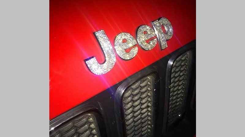
Image source: Pinterest
Throughout the company’s history, Jeep vehicles carried six different logos, all with different colors and symbols. After 1993, the company decided to keep it simple by using the company name in Helvetica bold font. The word is usually spelled out in bold silver right over the front grille of the vehicle.
24. Lamborghini
Image source: Pinterest
For most people, owning a Lamborghini vehicle is something they can’t even imagine. That’s why they may not even bother finding out what the Italian manufacturer’s logo even looks like. But to car enthusiasts, that image of a golden bull on a black background is one of the most iconic car logos in the game.
Though the popular emblem first appeared in 1972, the company replaced it with a simpler design only two years later. But when the Volkswagen Group purchased the brand in 1998, the logo went back to the recognizable black and gold image.
25. Land Rover
Image source: Pinterest
Jaguar’s Land Rover brand is famous for producing vehicles that can handle tough off-road conditions. Such durable vehicles deserve an equally practical logo. As it is, the green and silver emblem has remained more or less the same since its inception in 1948.
Over the years, the company experimented with different colors but usually kept the oval shape and Land Rover in different iterations of the car logo. Moreover, the brand even kept a trace of the zigzag line that ran through the company’s name in the original emblem.
26. Lexus
Image source: Pinterest
Toyota’s luxury vehicle division has a fairly simple yet elegant logo. Like its parent company, Lexus has a simple oval shape encircling the first letter of its brand name. The emblem is silver, allowing it to match any vehicle color.
27. Lincoln
Image source: Pinterest
Like the previous brand we have mentioned, Lincoln is a luxury car subdivision of another company. In this case, we’re talking about the American automotive manufacturer, the Ford Motor Company. The brand has used many drastically different car logos during its long history. However, the four-pointed star inside a rectangular frame has been a staple since 1972.
28. Lotus
Image source: Pinterest
Lotus is another British car manufacturer famous for producing high-quality sports and racing vehicles. Its logo is about as subtle as its products — which is to say, not at all. It shows a green triangle with rounded corners centered inside a yellow circle.
Inside the green shape, you’ll find the company name written under an amalgam of letters which represent the initials of the company’s founder, Anthony Colin Bruce Chapman.
29. Maserati
Image source: Pinterest
Maserati is yet another Italian manufacturer of luxury vehicles with a pretty unique emblem. The company’s logo pretty much always depicted a red trident rising from a blue surface — as though emerging from the sea. However, after 2015, the company started moving toward a more sophisticated version of its logo.
30. Mazda
Image source: Pinterest
Since the company’s inception in 1920, the Mazda Motor Corporation went through no less than eight car logos. However, the rounded square encircling the first letter of the brand’s name has been in use since 1997, with minor alterations. Like many other Japanese automotive manufacturers, Mazda has kept its emblem classy with an elegant, silver design.
31. Mercedes-Benz
Image source: Pinterest
The Mercedes-Benz logo has featured a three-pointed star inside a circle for more than a century. According to the company, the meaning of those three directions point to the capability and strength of its engines on the land, the sea, and in the air.
32. Mini Cooper
Image source: Pinterest
Even though Mini Coopers are as British as they come, the brand is now under the ownership of BMW. While the company used some version of the winged design we now know between the years of 1959 and 1969, it abandoned the symbol in favor of a shield design until 2001. At that point, it returned to its roots with a new and improved winged logo, which it later simplified in 2018.
33. Mitsubishi
Image source: Pinterest
For most of its history, Mitsubishi Motors has been represented by a three-blade fan. Though the emblem featured oval-shaped fan blades prior to 1873, it has been sharp and red ever since. During the 20th century, the company only made slight alterations to the shape of its car logos, but they stuck to the basic symbol.
34. Mustang
Image source: Pinterest
Even though Ford’s series of Mustang vehicles isn’t a brand in and of itself, it has one of the most legendary logos on the market. It only takes a glimpse of that metallic galloping horse to know which series a car belongs to.
35. Nissan
Image source: Pinterest
When it comes to branding, this Japanese automotive manufacturer had some hits and misses. In the end, Nissan settled on a circular logo design with its name written on a silver plate going across the design. The company revamped the symbol in 2020, but it has mostly remained the same for the past 30 years.
This company also sells its products under the Infiniti and Datsun brands. Both brands have oval-shaped logos, though Infiniti’s emblem is arguably more futuristic.
36. Oldsmobile
Image source: Pinterest
Oldsmobile is a now-defunct American manufacturer of luxury vehicles. Even though the company no longer exists, you should be able to recognize its final logo. Namely, it was a silver oval with a diagonal line representing its old symbol — a rocket. If you’re looking to buy a vintage Oldsmobile vehicle, you’ll want to study the brand’s other car logos to make sure you’re buying the real thing.
37. Peugeot
Image source: Pinterest
Peugeot is one of the oldest French automobile brands still in existence. Though the company is now owned by Stellantis, the quality of its vehicles has never wavered. For the past two centuries, the company’s car logos have always featured a symbol of their strength and speed — the lion.
In 2021, the brand revealed the latest version of its emblem, a black shield with the head of a lion facing left and the name of the brand written above it.
38. Polestar

Image source: Pinterest
Polestar is an electric car manufacturer owned by Volvo and its Chinese parent company, Geely. The Swedish brand has always been represented by a four-pointed star made up of two V-shaped objects.
39. Porsche
Image source: Pinterest
Porsche is a German car manufacturer that needs no introduction. The company’s original logo took inspiration from the official coat of arms of the Free People’s State of Württemberg.
Eventually, the brand added a horse into the picture, to represent the coat of arms of Stuttgart as well. After some minor changes, they ended up with a gold, black, and red shield-shaped logo that incorporates both of the original inspirations as well as the brand’s name.
40. Renault
Image source: Pinterest
Renault is another famous manufacturer of all sorts of vehicles, from trucks and tractors to buses and cars, and even some aircraft. The French company’s logo has been diamond-shaped for the past century or so. Over the years, the image has changed quite a bit, becoming sleeker and more modern.
41. Rolls-Royce
Image source: Pinterest
Rolls-Royce is another British manufacturer of luxury cars owned by BMW. While the company first used a coat of arms as its logo, it transitioned to a rectangular design featuring the letters RR in 1973. Rolls-Royce vehicles are also famous for their hood ornaments, which are known as the Spirit of Ecstasy or the Flying Lady.
42. Shelby
Image source: Pinterest
The American company Shelby undoubtedly has one of the most assertive car logos on the market. Its circular emblem features a half-coiled cobra with the word SHELBY written across the surface. While the snake’s head previously looked straight ahead, the symbol now shows it turned to the right, with its fangs showing.
43. Subaru
Image source: Pinterest
The Subaru logo has been circular or oval since 1953. The emblem contains six diamond-shaped stars — one large and five smaller ones. Those represent the five companies that merged to create Fuji Heavy Industries which is now known as the Subaru Corporation.
44. Tesla
Image source: Pinterest
According to Elon Musk, the Tesla logo was inspired by the cross-section of an electric motor. Namely, its T-shaped emblem matches up to the cross-section of a single rotor.
45. Toyota
Image source: Pinterest
Like most brands that have been around for a while, Toyota has gone through several logos. Still, the oval emblem that contains two more overlapping ovals was introduced in 1989. If you take a closer look, you’ll see that those shapes make up the letter T.
46. Vauxhall
Image source: Pinterest
Why use an existing animal to represent your company when you have a range of mythical ones to choose from? That was probably the thinking behind Vauxhall’s choice of representation. Since 1857, the company’s branding has included images of a griffin, the legendary creature with the body of a lion, and the head and wings of an eagle. Nowadays, the creature stands next to the letter V inside a circle.
47. Volkswagen
Image source: Pinterest
The Volkswagen logo is so famous it hardly requires acknowledgment. Still, if you didn’t know, the company’s circular logo contains the letters V and W stylized into a single W shape.
48. Volvo
Image source: Pinterest
Upon seeing the logo of this Swedish car company, you might think that it only markets its products to men. Why else would its emblem be the icon that represents the male gender? Well, according to the company, the image is actually the scientific symbol for iron. So it highlights the traditions of the Swedish iron industry.

